
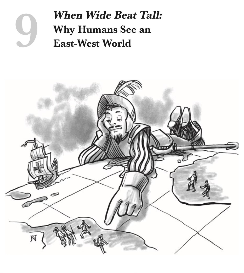
[POST] I spy with my little eye
A much larger impact zone for intense climate change than standard maps reveal

This is a reader-supported publication. I give it all away for free but could really use your support if you want me to keep doing this.
I have long been known as “that map guy” because of The Pentagon’s New Map. I readily admit that maps have always fascinated me, going back to my childhood. I find that they make everything so obvious when — before — you were left wondering why it had to be that way whatsoever.
As somebody who works primarily the future, I treat maps as cheat sheets that explain my “inevitabilities” better than any graph. You just see how there’s so much here and not enough there, so, the solution set is pretty clear (move some from here to there!).
In The Pentagon’s New Map, I wanted to show you how far globalization’s deep connectivity extended around the world to make clear that, where it had not taken deep root, we could locate the vast majority of the world’s organized and disorganized violence. Yes, a quartet of Cold War “tailbones” are out there still (Russia-v-former Soviet Republics, ROK-v-DPRK, China-Taiwan, Israel-Palestine) — all of which run hot and cold over the decades), but, if you mapped where US military forces were sent in the post-Cold War era, the demand signal was awfully clear — as in, equatorially centric.

In America’s New Map, I want you to view the world from a different angle, showing how that old map was being re-vectored into a new one.

So, as globalization becomes truly global (and swamps the Gap), we have gone from that bifurcated Core-Gap breakdown to a three-vertical slice scheme that emphasizes “vertical integration” as the future predominant dynamic in international affairs.

Here’s how I argued the visual map-shift in ANM:
Flat maps deeply influence how we see our world, establishing—and often distorting—our spatial understanding of where we stand relative to everyone else. Those global projections most familiar to us present America in the upper left-hand corner, confirming several cultural biases: Being on top is good and powerful. Being on the far left marks us as the truest Westerners. As many of us originated in Europe, that region naturally sits smack dab in the center. Since we read left to right, America begins the map in the narrative lead. Finally, with the dominant, north-biased Mercator projection, our fifty states visually equate to the entirety of South America, when—in truth—we occupy half its landmass.
Three-dimensional globes represent our spherical world with genuine accuracy, albeit with one huge bias. Nothing in this universe mandates that magnetic north is up while south is down, which is why plenty of ancient maps looked “up” to the east or even the south. Ptolemy, the second-century Greek cartographer who first applied the grid methodology of latitudes and longitudes, decided—for reasons lost to history—that north was on top. If he had chosen differently, America could have ended up where Australia is relegated today: the strategic cul-de-sac that is the lower right-hand corner.
Imagine the ignominy!
Then there are our cognitive maps, or the way our minds organize and remember spaces once explored. For the longest time, our forebearers came (or were forcibly brought) here from continents to the east. Having landed on our East Coast, they settled ever westward as our nation expanded. To us, the East is old, yesterday, and crowded, while the West is forever new, tomorrow, and limitless. We apply no such distinctions to North or South—just colder or warmer.
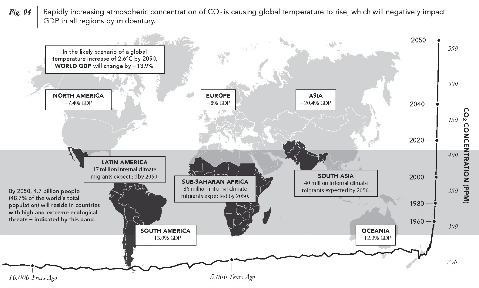
All those geographic biases are challenged by a globalization that recently elevated Asia and now empowers the South. Climate change adds injury to that insult, turning our world upside down by centering itself in the Global South and unleashing its most destabilizing dynamics northward. In short, those Northern powers that long ruled this world now feel themselves on the receiving end of its turbulent waves of change—a truly humbling experience that nonetheless reflects humanity’s stunning capacity to redefine our planet.
Per Jared Diamond (and described at length in ANM), this longstanding E-W bias makes sense, because “wide” regions came to rule “tall” ones, having had the early start on development afforded by their environmental sameness that allowed advances to spread rapidly across that vast Eura-Asian swath running from Ireland to Japan. Now, as I argue in ANM:
Through Diamond’s analysis, we understand the power of one geographically expressed axis (East-West) over another (North-South). Once we accept that, we can imagine that power relationship being reversed through superior environmental forces. If previous, imperial iterations of globalization were fundamentally predetermined by our planet’s environmental makeup, then we can posit that US-style globalization, having so reshaped Earth’s environment as to earn its own geologic era, now determines humanity’s future path.
That’s the great pivot of my book: Diamond showed us a world map in which wide regions rule and tall regions were ruled. ANM essentially flips that argument, citing the twin dynamics of demographic aging and climate change, to state that, now, it is far better to be tall and thin than to be wide and short. In sum, the less geographic exposure you have to lower latitudes (percent of your region’s landmass), the better. While, the more high latitude area you encompass, the more space for “pressure relief” one has to accommodate the inevitable poleward movement of humanity (matching that of nature for decades now).
In ANM, I cite the map bias against South America vis-a-vis North America, when the far bigger misrepresentation is, of course, Africa vis-a-vis anybody.
So, it was with interest that I came across this article describing the push by African leaders to get the rest of the world to view their geographic standing more honestly.
NYT: Africa Is Big, and It Wants the World’s Maps to Show It; A campaign is underway to replace the world’s most popular map, which the effort’s supporters say promotes a false view of the continent and its size.
Here’s the simple comparison that the NYT offered between the classic Mercator projection versus a more equal one:

Below is the Gall-Peters projection that lines everything up E-W and N-S, yielding honestly-sized continents — and yeah, Africa really does visually dominate here. Notice also how much bigger Latin America is to Anglo North America.

Other ways to contemplate Africa’s huge size

And another way to reveal just how outsized our impressions are regarding the Global North:
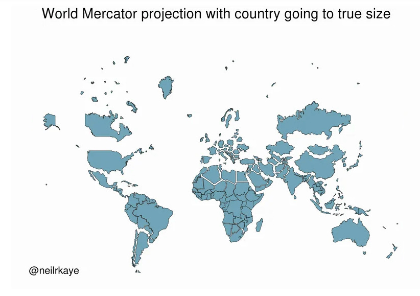
My point is all this: we have always mentally undersized Africa and South America — but especially Africa, which will comprise 40% of humanity come mid-century, or 2 out of 5 humans.
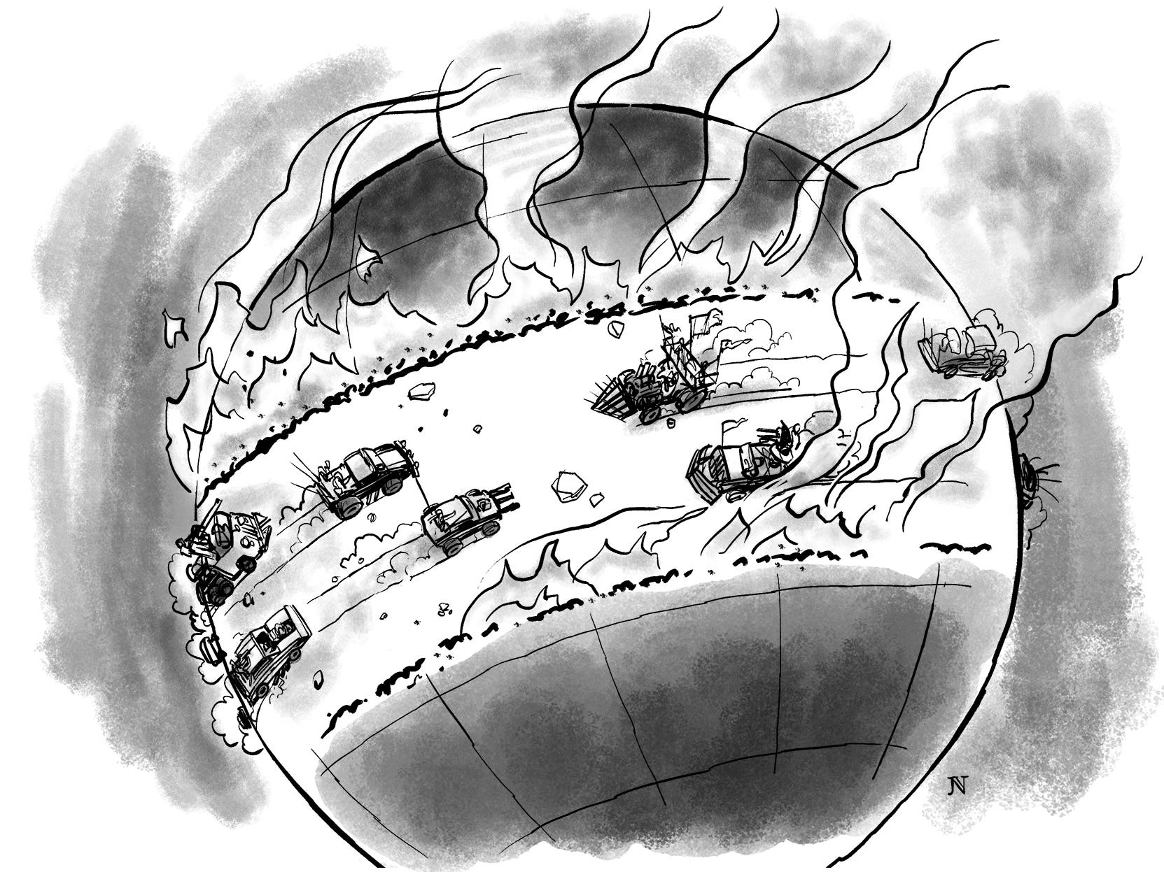
See this data visualization/map from ANM (admittedly hugely biased) and mentally add up the mostly highly impacted landmasses (Middle Earth) and then visually compare them to the Global North.
Doesn’t look so bad, does it? Sure, a lot of people to be put on the move but look at all that underpopulated/open space to the North!
Now, take a look at a Gall-Peters projection with my Middle Earth (30 degrees north and south of the equator) marked out and I think you’ll have a different sense of how widely climate change is going to devastate the world’s continental landmasses — in effect, ruining a very large percentage of Earth’s land surface and forcing a lot of migration toward a Global North that we’ve historically thought is a lot larger than it really is, relative to that Global South about to be remapped by climate change.
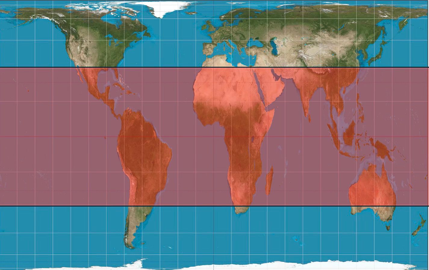
Looks a bit more intimidating as a world-pathway prospect, does it not?
Right now we can estimate that my Middle Earth zone encompasses a bit more than half of the world’s population — as well as just over half of the world’s non-Antarctic landmass, with the high latitudes north and south currently accommodating the other near-half of the world’s population.
Now, imagine a future Earth where it is extremely hard to grow food or just plain live across the vast majority of that Middle Earth band and think about half of humanity having to choose between making it work (and having the wealth to do so) or making for higher latitudes.
And then imagine a far emptier Middle Earth (1/2 of world’s non-Antarctic landmass) and a far more crowded Global North (just over 1/3rd of world’s non-Antarctic landmass).

THAT is the key international dynamic of this century: a demographically fertile (relatively so) Middle Earth being extremely stressed by climate change and facing the imperative to head to safer ground (almost all of it toward the North) that is, by the way, experiencing a demographic collapse as it warms.
You can come back at me with all manner of arguments about why this will never happen — except it will.
Why?
Because life finds a way.
You can and should find this global future intimidating but not existential.
Humanity will adapt and humanity will move but humanity will not die.
Realizing that, however, is no excuse for not creating that future ourselves (i.e., North-South integration) versus trying to hold it at bay (name your King Canute wall of choice).
The only way forward is through.


One tour as a Navy navigator makes you think that way. Canada - 10 million square miles. Largest expanse of USSR - 17 million square miles. Africa - 30 million square miles. I memorized that a while ago for your very point. But.... also shows the unlikelihood of the myth that Africa has ever been unified. Way too big, never.