The curious case of "climate velocity"
Species are on the move poleward because climate is doing the same
Time and again when I give the brief or do media engagements concerning America’s New Map, the data points that seem to most impress people and stick in their brains has to do with the indisputable migration of species over time: upwards of 2km poleward per year and just over 1 meter in higher in elevation per year. As I say in the book:
For us house dwellers, that seems minor. For nature, these rates are three times the normal pace.
For species responding to altered climate, the logic is simple: you either adapt, move, or die. We are living through the Sixth Mass Extinction era in planetary history — largely of humanity’s making. And we watch species furiously attempt to adapt at a pace scientists estimate as being roughly 10,000 time normal evolutionary speed. Most will fail.
Given those two very hard choices, moving alongside the climate is the path of least resistance.
So, it’s pretty simple to understand: warming planet alters the climate, shifting it around, and animals simply go with that.
People get that because they have experienced it. Here’s the simple story I relate in the book:
As a child growing up in Wisconsin, I was dazzled by rainbows, as they were rare. After living several decades out east, I moved back to the Dairy State and was stunned to see more rainbows in one summer than I had encountered across my youth. That frequency is hardly unprece- dented; spend any time in Hawaii, the Rainbow State, and you will routinely spot them. But in Wisconsin, those rainbows really knocked me for a loop, as though my home state had imported some other state’s weather.
It turns out that is exactly what is going on.
Thanks to climate change, global cloud patterns and dynamics have migrated poleward. What used to be midlatitude storm tracks are now found at significantly higher latitudes, in large part because subtropical dry zones, saddled with mega-droughts, have expanded, pushing higher-altitude clouds poleward. At higher latitudes, this crowding effect stacks cloud formations, rendering them thicker and taller and thus turbocharging their precipitation. All this makes Middle Earth far hotter and drier and the North tumultuously wetter—hence more Wisconsin rainbows.
Another way to visualize the change is to imagine how one’s state heads “southward” in terms of climate. See this cool but small (and thus a bit blurry) map of Michigan “migrating” over this century.
The upshot (hard to read) is that, in the low-emission scenario, Michigan migrates to the Missouri-Arkansas border and that, in the higher-emission scenario, it’s basically moved to North Texas. Wrap your mind that with regard to your children!
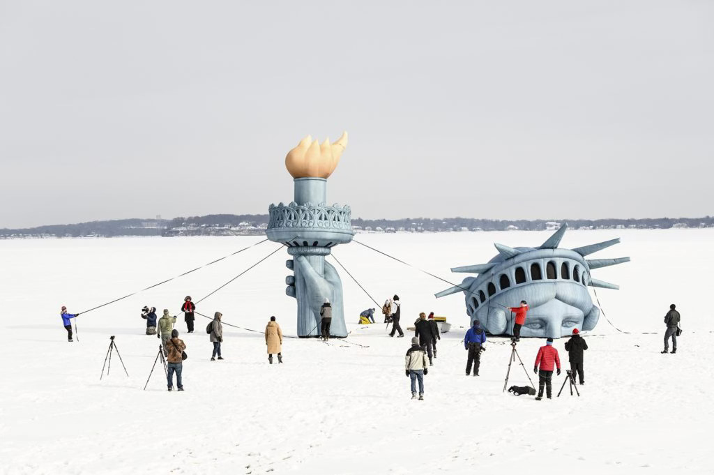
But here’s my favorite new example: Back in the late 1970s a bunch of pranksters ran for student government at the University of Wisconsin. Once in power they became legendary for the feats they’d pull off, like “sinking” the Statue of Liberty in Lake Mendota, which later morphed into an annual public art exhibit.
I know, it’s just makes you wanna:
Trust me, plenty of stoned undergrads have performed that shtick on the frozen lake over the years. It is still on my bucket list, I must confess.
Anyway, the other big prank this group of students pulled off was to place several hundred plastic pink flamingos on Bascom Hill one day in 1979 (my future spouse happened upon them early that morning). The joke was naturally the fish-out-of-water quality of seeing a tropical bird in a state infamous for its brutal winters. This too has become a student tradition at Wisconsin, recreated each year.
But, guess what happened this summer? The Summer from Hell?
You guessed it! Pink Flamingos spotted just north of Milwaukee along Lake Michigan.
That kind of evidence is hard to resist.
But back to the causality, which is the migration of weather patterns (and clouds) — also poleward. I ran into this fascinating concept in an amazing article (“Redrawing the Map: How the World’s Climate Zones Are Shifting” by Nicola Jones leveraging data from the Yale School of the Environment.
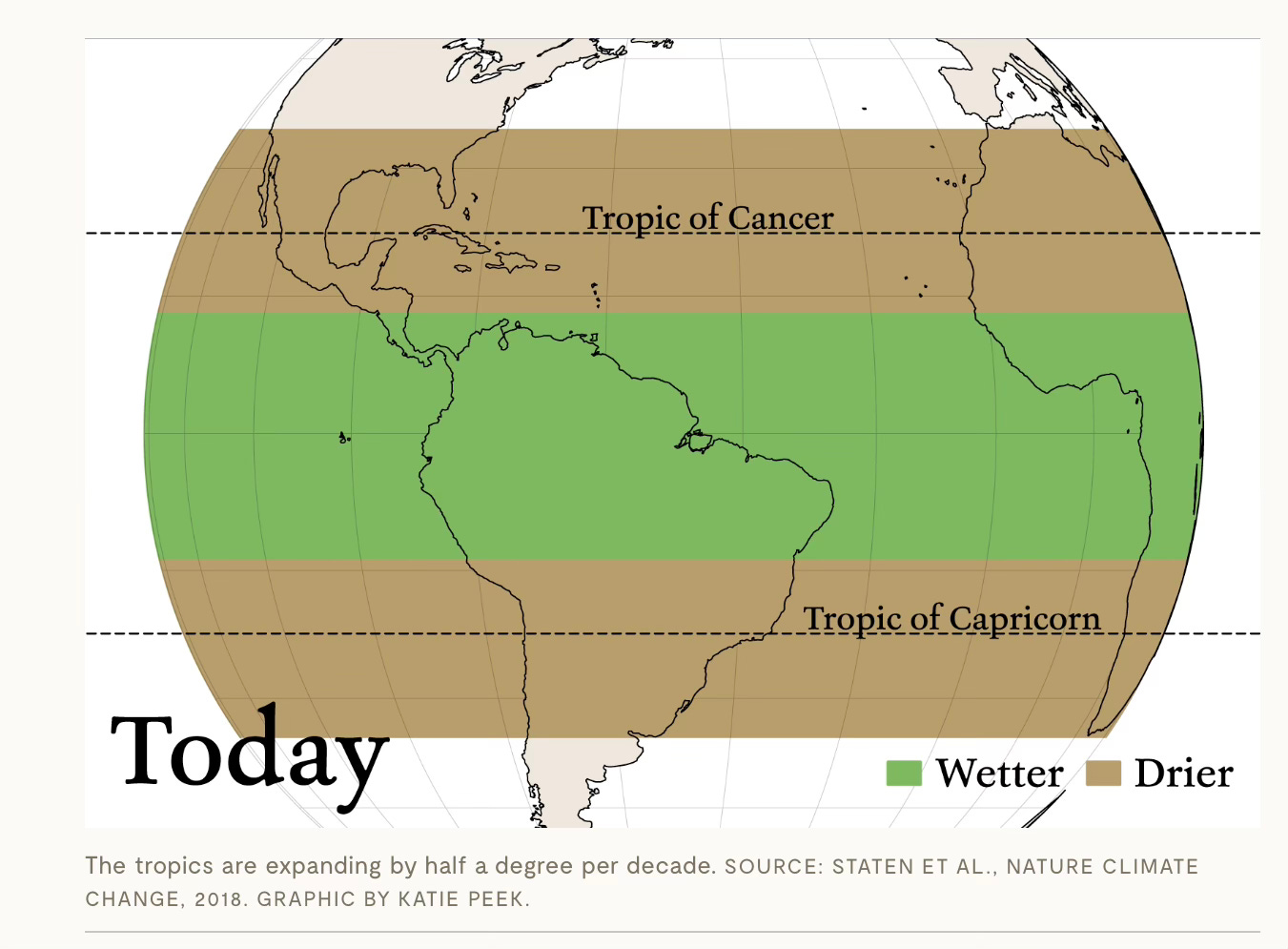
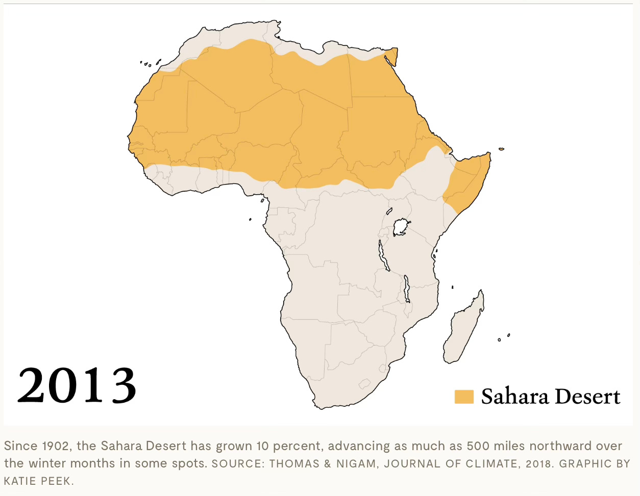
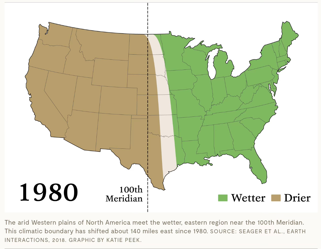
Here are the major examples cited (with maps in certain instances where the changes are easier to spot; go to the site for the actual animations not captured here):
THE TROPICS ARE GETTING BIGGER AT 30 MILES PER DECADE
THE SAHARA DESERT HAS GOTTEN 10 PERCENT BIGGER SINCE 1920
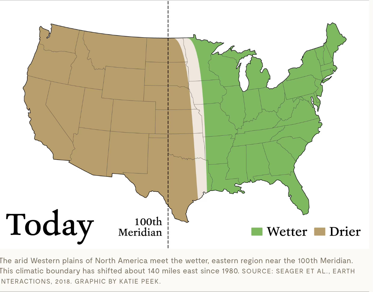
THE 100TH MERIDIAN HAS SHIFTED 140 MILES EAST
TORNADO ALLEY HAS SHIFTED 500 MILES EAST IN 30 YEARS
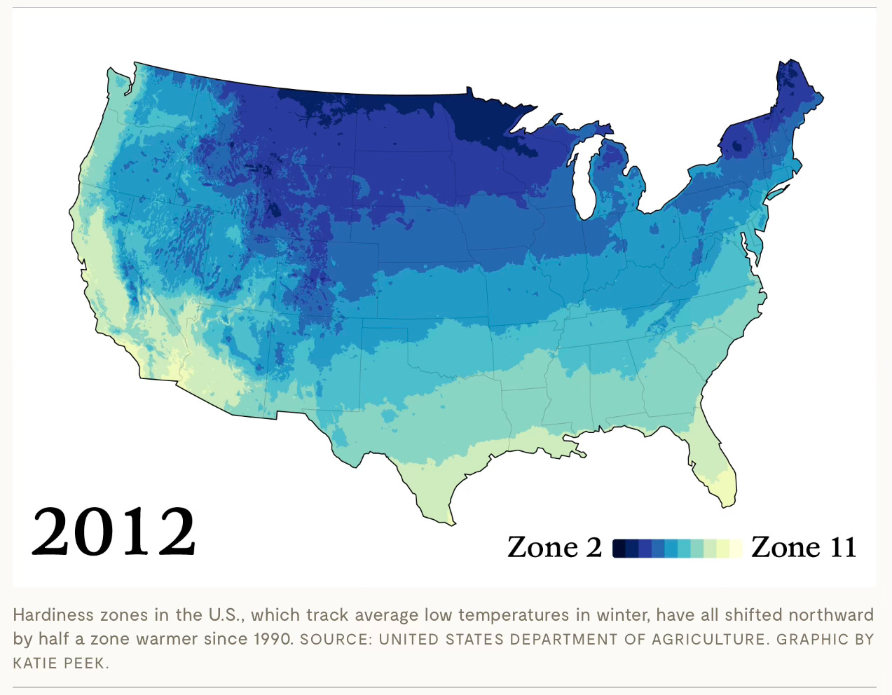
PLANT HARDINESS ZONES ARE MOVING NORTH IN THE U.S. AT 13 MILES PER DECADE
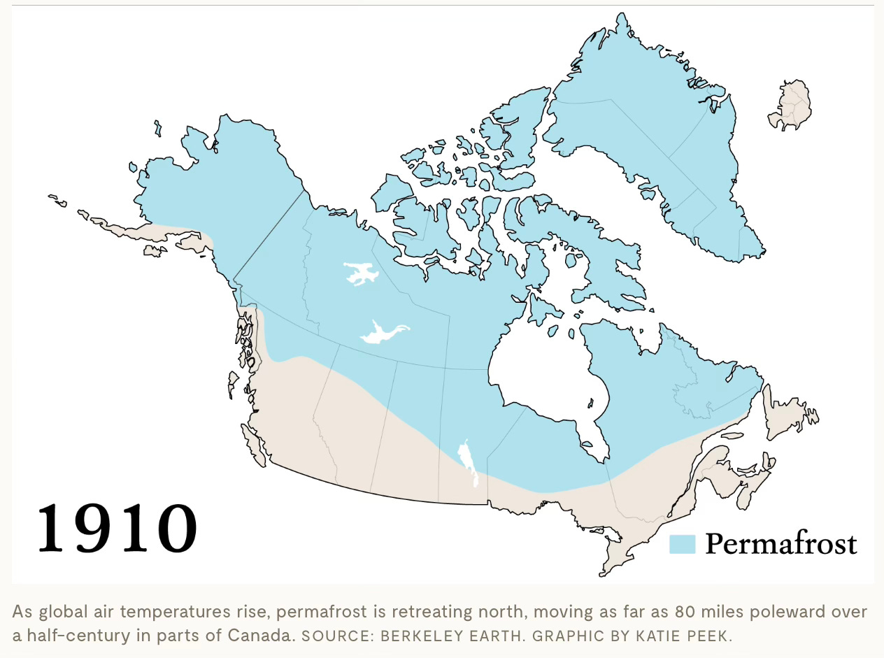
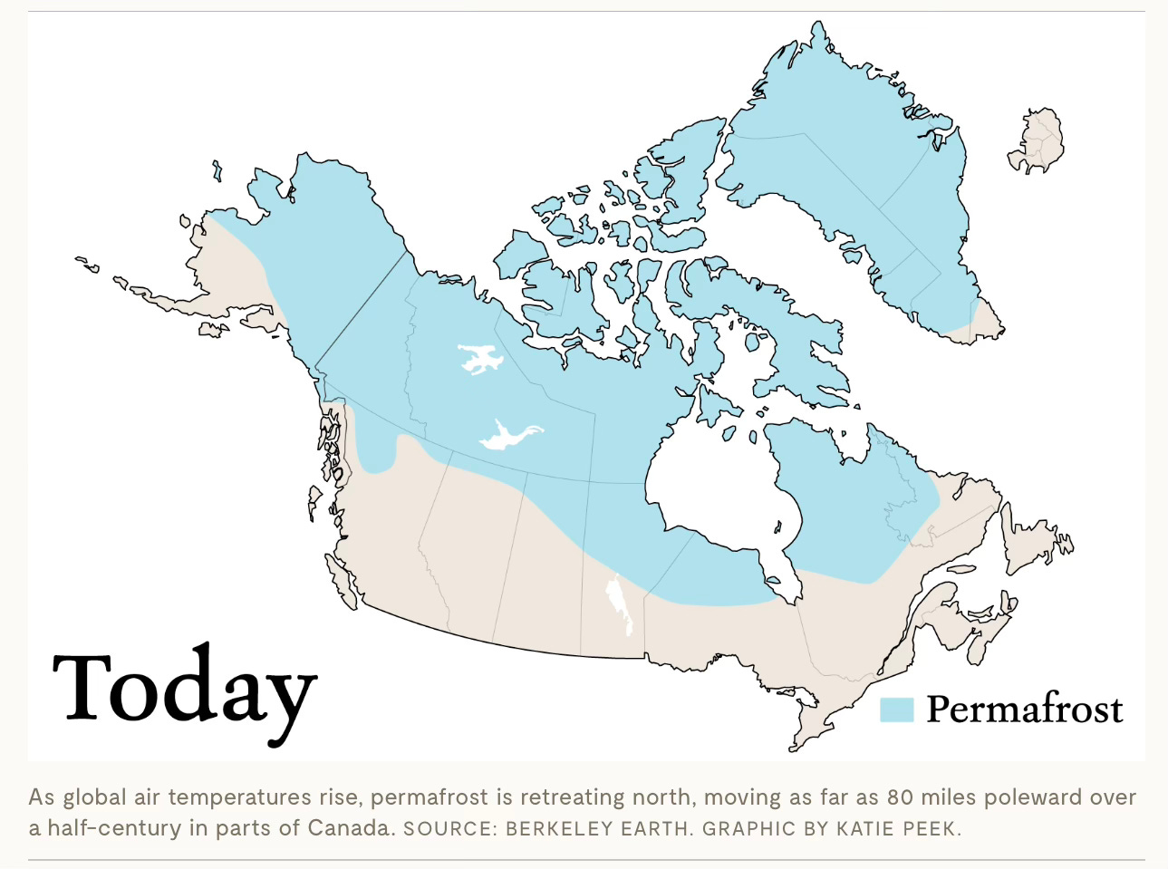
THE PERMAFROST LINE HAS MOVED 80 MILES NORTH IN 50 YEARS IN PARTS OF CANADA
THE WHEAT BELT IS PUSHING POLEWARD AT UP TO 160 MILES PER DECADE
The map that I most wanted to see wasn’t done. It had to do with this data point:
North America is seeing the opposite phenomenon: Its arable land is romping northward, expanding the wheat belt into higher and higher latitudes. Scientists project it could go from about 55 degrees north today to as much as 65 degrees North — the latitude of Fairbanks, Alaska — by 2050. That’s about 160 miles per decade.
Like I say in the book:
Pragmatically speaking, climate change is most easily grasped like real estate, where the three most important rules are location, location, location. Climate change transforms our planet location by location, taking things long associated with one region and moving them somewhere different. What is happening may not seem unprecedented to you, but where it is happening should.
I have found this sort of simple and direct storytelling works best, because no matter how much you might distrust science and scientists, it’s far hard to distrust animals simply responding to changes in nature.


